HACK THE NORTH 2025
Creating an immersive application journey for 7000+ applicants
SKILLS
Creative Direction
Interaction Design
Visual Design
Wireframing
ROLE
Product Designer
TEAM
Design Team Lead
Graphic Designers
Frontend Devs
TIMELINE
4 weeks (May 2025)
WHAT IS HACK THE NORTH?
Hack the North is Canada’s largest hackathon where 1200+ hackers from all over the world are gathered at the University of Waterloo for a 36-hour hackathon. We stand out from other hackathons through the quality and care we put into every aspect of the event, bringing hackers the best workshops, mentors, prizes, and fun, hands-on learning experiences!

HACKER APPLICATIONS
The application is one of the first experiences people encounter and marks the beginning of many hackers’ Hack the North journey. This makes it one of the most important projects, involving close collaboration with graphic designers, frontend, and backend developers. At Hack the North, our goal is always to ensure the application isn’t just a boring form but a personalized, fun adventure!
put final design first
show explorations
PROCESS WORK
A Look Into my Design Process
What feelings are we trying to invoke?
Every year the team establishes values and keywords we want to consider while creating any digital or physical product related to the event. I made sure to keep these keywords in mind while coming up with my goals and creative direction.

I specifically focused on these keywords!

GOALS
What am I Trying to Achieve with Hacker Applications?
Design for students. The application should be intuitive and easy to fill out for our target users, high school and university students.
Create an impression. Let applicants understand the direction and value of this year’s event; the application should reflect the theme and give a glimpse of what hackers can expect.
Not another boring form!! The application should spark excitement—making the process fun, engaging, and totally personable!
BRAINSTORMING AND BUILDING A VISUAL THEME + CONCEPT
Figjam Party!!
To kick off our visual theme, all 48 organizers jumped into a FigJam board to paste and jot down any inspiration that came to mind. We also prepared a few prompts to help guide the type of ideas and inspiration we were looking for.
🖼️ Snapshots of some of our inspo boards

⭐️ Finalized Concept: Cave Exploration
After discussion, the design team decided that cave exploration would be a fresh and exciting direction. This concept opened up many creative possibilities for our digital products, evoking feelings of exploration and "discovering the unknown". We envisioned three distinct cave themes, each with its own colour palette and visual style to add variety and interest.

IDEATION
Creating a User Flow that Tells a Story
Each year, we include a customizable element that makes the application process more fun and unique. After noticing the rise in popularity of personality quizzes, Buzzfeed quizzes, etc. I chose to create Hack the North's own personality quiz. Additionally, this provided the perfect opportunity to tie in our concept of having three realms.
I wanted the application to almost feel like a first person adventure game, so I mapped narrative moments to each step of the user flow, letting applicants "explore" as they moved through the process.

Creating Mockups
I used simple vectors and shapes as quick prototypes to clarify my thinking and align with graphic designers on the direction before moving into detailed work. I looped in frontend developers early to get input on feasibility, ensuring alignment across the team. This way, we could move forward confidently, and graphic designers wouldn’t have to worry about creating assets that might not be used.

concept sketches created on procreate

examples of early stage mockups
A huge part of creating the mockups was shaping the creative direction and setting the vision for the overall look and feel. I shared visual inspiration to spark ideas with the graphic designers and worked closely with them, putting together asset lists so they had a clear guide while still leaving space for creativity.

list of requested graphic design assets

inspo for personality quiz tiles
DESIGN CHALLENGE
Reducing Cognitive Load
Since the application also carries a narrative with more complex graphics that could feel overstimulating, I wanted the forms themselves to be as straightforward as possible. So, I explored and researched chunking pattern designs.

one long form field
⭐️ form field with chunking
Each field is presented one at a time with a scrolling animation, creating the feeling of checking tasks off a list and giving users a sense of quick progress
A comparison of a broken-up, multi-step form vs. a single long form
DESIGN CHALLENGE
Improving User Retention
When mapping out the components, a progress bar was essential to give users a clear sense of where they were in the application. At the same time, I needed a top navigation bar to hold key actions like sign-out and account access. My goal was to design something intuitive, minimal in screen space, and fully aligned with the visual theme of the experience. My first explorations focused on simple progress bars that only indicated which step the user was on. These were designed as a separate component from the navigation bar, but ultimately felt too plain and disconnected.

The final design combined navigation and progress into one seamless component, giving users the ability to move between steps while always knowing where they are. This approach reduces:
drop-off from uncertainty
creates a sense of momentum
encourages task completion
builds trust by giving users more control

DESIGN INITIATIVE
Adding a Touch of Magic and Fun
In past years, we created small digital mementos for hackers to share online, but they didn’t gain much traction. This year, inspired by Figma’s Figpals, I proposed a more engaging idea: a digital companion that follows applicants throughout their journey. After defining the algorithm for the personality quiz, I mapped out the traits each Hack Pal could have. Based on users’ answers, they are then assigned a specific Hackpal that matches their personality.

Hackpal designs created by graphic designer Flora Hu
Giving our Hackpals Character
Motion and the way the Hackpals move became the voice of the HackPal, expressing playfulness and encouragement, while maintaining an emotional connection that made the companion feel like a supportive partner rather than a gimmick.

Documentation of behaviour of Hack Pal
Interaction Design Principles
I designed the HackPals to always feel responsive and alive, reacting instantly to user interactions like hover or idle time. At the same time, I prioritized user control: they could dock, minimize, or move their pal aside if they found it distracting. Personality and interactions were revealed gradually (progressive disclosure), helping users build a relationship with their pal without cognitive overload. Accessibility was also considered, ensuring animations respected reduced-motion preferences and maintained strong contrast.
DOCUMENTATION
3 Realms, 3 Times the Amount of Variants
I wanted to ensure all necessary interactions were captured in our designs, including hover, inactive, and active states, to make the experience feel complete and intuitive. With these states and variations for each realm, this resulted in a large number of variants, ultimately contributing to a comprehensive and flexible design system.
While creating documentation for the developers, i made sure to have the following label: the class , component type, use cases, states and realms.

example of documentation of a form field component

Mini design system created for hacker apps
FINAL DESIGN
Let's Apply to Hack the North 2025
Our journey starts at the top of the mountain…
Create your applicant account by inputting your email and password or if you already have one, you can log in here.
We'll be guided to a magical dark cavern down the inside of the mountain
This is where you will get to complete a 5 question personality quiz which will determine the theme + other customizations for the rest of the application.
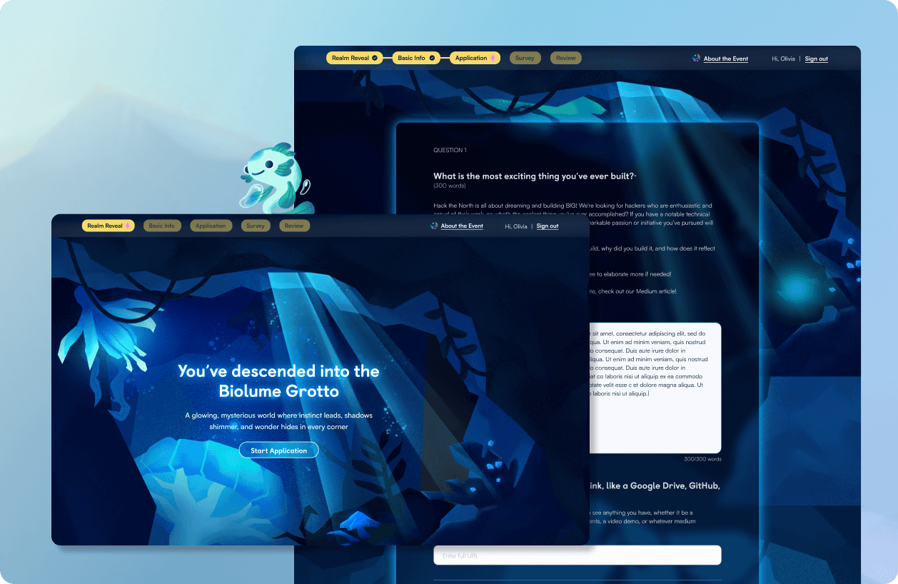
Now we'll be transported into a realm and where our companion is awaiting us
Through the personality quiz, users are guided to one of three magical realms. Here, you’ve uncovered the Biolume Grotto. Each realm is home to a variety of companions, your loyal Hackpals, who will journey with you every step of the way!
We can now easily fill in the blanks with our personal details
This section includes simple text input fields and dropdowns, allowing applicants to fill out their personal information in under a minute.
Now we can continue to the application questions, with a few delightful interactions along the way
This is the most important part of the application, where applicants complete their long-answer responses along with a few additional logistical questions.
We've reached the end of our adventure where we can review our answers and submit our application
In the final step, applicants can review their answers and make any necessary edits. Once submitted, they’ll receive a confirmation and a small digital memento!
REFLECTION
Challenges & Outcomes
Successfully Communicatinng and Bringing Complex Ideas to Life
Many of my application ideas were unconventional, so I focused on communicating them clearly to designers and developers. By putting myself in their shoes, I learned to document effectively and provide visual inspiration to make abstract concepts easy to understand.
When There is too Much Creative Freedom
This was one of the first projects where I had full creative freedom and could request assets directly from graphic designers to bring my ideas to life. While that was exciting, it was also a reminder to stay grounded in core design principles. There were countless directions I wanted to explore, but I learned to step back and make sure creativity never came at the cost of usability or clarity.
Thanks for Stopping By!
Got any ideas, questions or feedback? I’d love to chat :)